

Warm Neutral Paint Colors That Make A Home Feel Cozy For Autumn
Autumn will be here before you know it, and July is the perfect month to plan your interior painting projects in Plano. Warm neutral paint colors give a home that cozy, welcoming feeling homeowners crave when the weather cools down. These shades include creamy beiges, soft taupes, warm whites, and greige tones that flatter almost any furniture style. They also photograph well, which matters if you plan to sell or host guests during the holidays. Cool grays dominated design for a decade, but the market has shifted back toward warmth. Paint manufacturers like Sherwin Williams and Benjamin Moore now feature warm neutrals in nearly all of their trending color collections. Choosing the right shade takes more thought than grabbing a swatch at the hardware store, because undertones behave differently in Texas light. This guide covers the best warm neutral paint colors for autumn and how to use them so every room in your home feels cozy.
The Best Warm Neutral Paint Colors For A Cozy Autumn Home
The best warm neutral paint colors share one thing in common: undertones that lean yellow, red, or brown instead of blue or green. Those undertones are what create warmth on the wall. A neutral with a blue undertone will read cold and flat once autumn light gets shorter and lower in the sky. A neutral with a soft yellow or red undertone will glow in that same light. Popular warm neutrals include creamy beige, greige, taupe, and warm white, and each one serves a different purpose in the home. Beige works hard in living rooms, greige bridges modern and traditional styles, and warm whites keep small spaces bright without feeling sterile. North Texas homes get intense sunlight most of the year, so warm neutrals also help soften glare in rooms with big windows. Below are the specific shades that perform best in each part of the house.
Creamy Beige Warm Neutral Paint Colors For Autumn Living Rooms
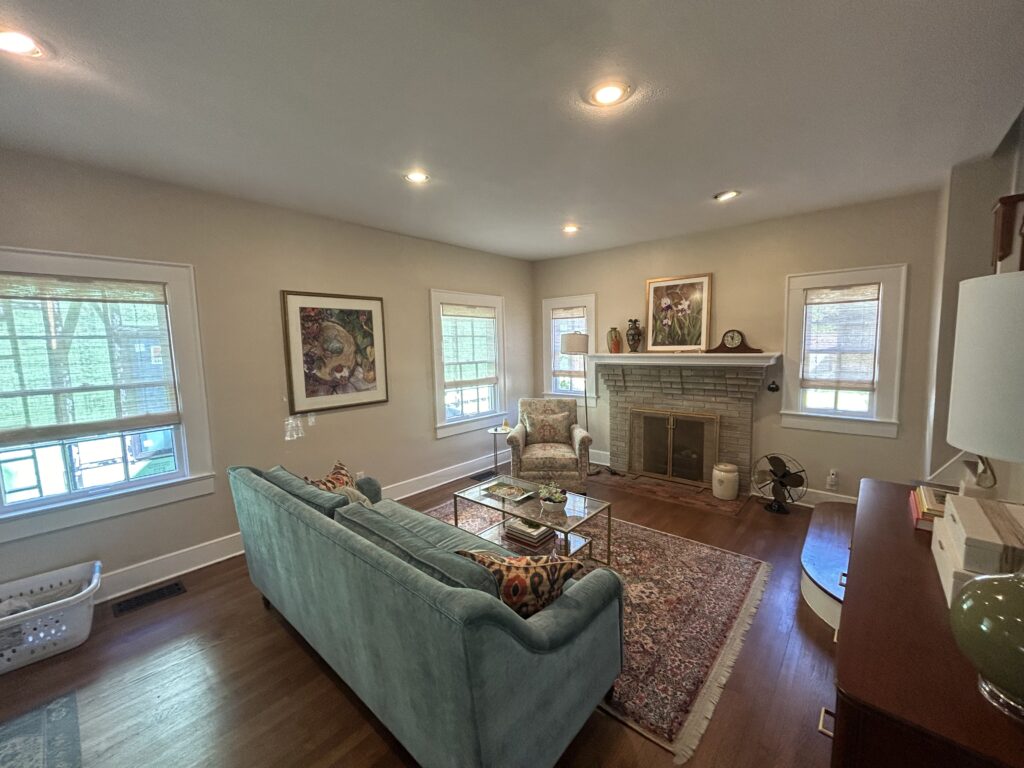
Creamy beige is the classic warm neutral, and it remains the most requested living room color in the Dallas area for good reason. Shades like Sherwin Williams Accessible Beige and Benjamin Moore Manchester Tan carry gentle yellow and brown undertones that make a living room feel settled and calm. These colors pair beautifully with the leather furniture, wood floors, and stone fireplaces common in Plano homes. Beige also hides minor scuffs and handprints better than white, which is a real benefit in high traffic family rooms. When autumn arrives, creamy beige walls make throw blankets, candles, and seasonal decor look intentional instead of cluttered. The color acts as a warm backdrop rather than competing for attention. It works in open concept layouts because it flows naturally into kitchens and hallways. That flexibility is why designers keep coming back to it year after year.
Lighting changes how creamy beige performs, so pay attention to which direction your living room faces. South facing rooms in Texas get strong, warm light most of the day, and a beige with heavy yellow undertones can start to look golden or dated in that exposure. In those rooms, pick a beige with a slightly muted or gray leaning base to balance the sunlight. North facing living rooms receive cooler, softer light, which means a richer, creamier beige will keep the space from feeling gloomy. East and west facing rooms shift throughout the day, so test your swatch in the morning and again in the evening. Autumn light sits lower on the horizon and casts longer shadows, which deepens beige tones noticeably. A shade that looked pale in July can feel wonderfully cozy by October. That seasonal shift is exactly why beige is such a smart autumn choice.
Finish selection matters just as much as the color itself when painting a living room beige. Most professional painters recommend an eggshell or matte finish for living room walls because it diffuses light softly and hides small drywall imperfections. Flat finishes look elegant but scuff easily, so save them for low traffic spaces like formal dining rooms. Satin works well on trim and doors where you need durability and easy cleaning. Quality matters here too, because cheap beige paint often dries patchy and shows lap marks in afternoon sun. A premium paint with high quality pigments will hold its color evenly across large wall spans. Proper prep work, including patching, sanding, and priming, is what separates a smooth professional result from a streaky weekend project. Ready to give your living room a warm autumn refresh? Click here for our interior painting service.
Greige Warm Neutral Paint Colors That Feel Cozy In Fall Light
Greige blends gray and beige into one balanced neutral, and it has become the most versatile warm color family of the past several years. Shades like Sherwin Williams Agreeable Gray and Benjamin Moore Edgecomb Gray lean warm without reading yellow. This makes greige ideal for homeowners who loved the modern gray trend but want more warmth for fall. Greige adapts to nearly any style, from farmhouse to transitional to contemporary. It complements both cool toned quartz countertops and warm toned hardwood floors, which is rare for a single color. In autumn light, greige deepens into a soft, moody tone that feels expensive and intentional. It photographs beautifully for holiday cards and real estate listings alike. If you can only pick one color for a whole house repaint, greige is usually the safest bet.
Undertones separate a great greige from a disappointing one, so learn to spot them before you buy. Some greige shades carry hidden green undertones that turn muddy against warm wood trim. Others lean purple, which can clash with tan carpet or travertine tile found in many Plano homes. Hold your swatch against a pure white sheet of paper to reveal the true undertone quickly. Then check it against your flooring, countertops, and largest furniture pieces. A greige with a soft brown or taupe base is the safest match for most North Texas interiors. Remember that autumn light amplifies whatever undertone exists, so a subtle green cast in summer becomes obvious in November. Taking twenty minutes to test undertones saves you from repainting an entire house.
Greige also solves a common problem in open floor plans, where one color must connect a kitchen, living room, and hallway. Because it sits between warm and cool, greige harmonizes with stainless appliances in the kitchen and cozy textiles in the living room at the same time. You can deepen the look by painting an accent wall one or two shades darker in the same greige family. This adds dimension without breaking the flow of the space. Greige also pairs exceptionally well with painted cabinetry in cream, sage, or deep navy. Many homeowners refresh their kitchen cabinets at the same time as their walls for a complete autumn transformation. The combination of greige walls and freshly refinished cabinets can make a dated kitchen feel brand new. Thinking about updating your kitchen along with your walls? Click here for our cabinet refinishing service.
Warm White And Taupe Neutral Paint Colors For Autumn Bedrooms
Bedrooms benefit from warm neutral paint colors more than any other room, because these are the spaces where you unwind at the end of the day. Warm whites like Benjamin Moore White Dove and Sherwin Williams Alabaster keep a bedroom bright while still feeling soft and restful. Stark, cool whites can make a bedroom feel like a hospital room, especially under artificial evening light. Warm whites avoid that problem by carrying a whisper of cream or ivory in the base. They reflect lamplight in a golden way that makes autumn evenings feel inviting. Warm white also gives you total freedom with bedding, curtains, and seasonal decor. You can swap in plaid throws and amber accents for fall without repainting anything. That flexibility makes warm white one of the smartest long term bedroom investments.
Taupe takes the coziness a step further for homeowners who want a moodier autumn bedroom. Taupe blends brown and gray with subtle red or purple undertones, creating depth that flat beige cannot match. Shades like Sherwin Williams Balanced Beige or Benjamin Moore Shaker Beige sit in this family and pair beautifully with white bedding and dark wood furniture. Taupe absorbs light rather than bouncing it around, which naturally makes a bedroom feel enclosed and calm. In autumn, when evenings get longer, that enveloping quality becomes a genuine comfort. Taupe also flatters warm metals like brass and bronze that dominate current lighting trends. Consider taupe for a primary bedroom and warm white for guest rooms and kids rooms. This gives each space a purpose while keeping the whole house cohesive.
Sleep quality research supports the choice of muted, warm colors in bedrooms, since bold or highly saturated walls can feel stimulating rather than restful. Warm neutrals lower visual noise and help the brain wind down. Ceiling color matters here too, and painting the ceiling a warm white instead of builder grade flat white completes the cozy effect. Do not forget the closet interiors and trim, because mismatched old white against fresh warm white looks unfinished. A full bedroom repaint, including ceiling, walls, trim, and doors, typically takes a professional crew one to two days. Doing it in late summer means the room is finished, aired out, and ready before the fall season begins. Paint needs time to cure fully, and warm July temperatures actually help interiors dry on schedule. Planning ahead now means zero paint fumes during the holidays.
How To Use Warm Neutral Paint Colors To Make A Home Feel Cozy
Picking a beautiful warm neutral is only half the job; using it correctly is what actually makes a home feel cozy. Placement, lighting, sheen, and pairings all change how a color performs on the wall. A perfect greige can look wrong next to the wrong trim color, and a lovely beige can wash out under cool LED bulbs. Professional painters and color consultants follow a simple process to avoid these mistakes. They evaluate natural light first, then coordinate walls with trim and cabinetry, and finally test large samples before committing. Homeowners who skip these steps often end up repainting within a year, which doubles the cost. The good news is that each step is straightforward once you know what to look for. The sections below walk through exactly how to use warm neutral paint colors for a cozy autumn result.
Choosing Warm Neutral Paint Colors Based On Natural Light
Natural light is the single biggest factor in how warm neutral paint colors appear inside your home. The same gallon of paint can look creamy in one room and dingy in another based purely on window direction. South facing rooms in Texas receive warm, intense light for most of the day, which intensifies yellow undertones. In those rooms, choose a neutral with a slightly cooler or grayer base so the walls do not turn golden by afternoon. North facing rooms get cool, indirect light that mutes warmth, so they need richer, creamier neutrals to feel cozy. East facing rooms glow warm in the morning and cool in the afternoon. West facing rooms do the opposite, turning amber during autumn sunsets. Map out your window directions before you ever open a paint deck.
Autumn changes the equation because the sun sits lower in the sky from October through February. Lower sun angles push light deeper into rooms and cast a warmer, more golden tone across walls. A neutral that looked balanced in June may look noticeably warmer by November, which is usually a pleasant surprise with these colors. This seasonal shift is exactly why warm neutrals are recommended for fall rather than cool grays or icy whites. Tree cover also changes in autumn as leaves fall, and rooms shaded all summer may suddenly receive direct light. Consider how your specific lot and landscaping affect each room across seasons. Homes backing up to greenbelts in Plano neighborhoods often see dramatic light changes between summer and fall. Choosing paint in July with autumn light in mind is a professional level move.
Artificial lighting deserves equal attention, because autumn evenings mean lamps and fixtures do more of the work. Bulb temperature is measured in Kelvin, and warm neutrals look best under bulbs between 2700K and 3000K. Cooler bulbs at 4000K and above strip the warmth out of beige and greige, leaving walls looking gray and flat. Check every bulb in a room before finalizing a paint color, and replace mismatched bulbs first. Dimmer switches enhance cozy neutrals by letting you lower light levels on chilly evenings. Recessed lighting placement also matters, since downlights graze walls and highlight texture. A professional painter will point out how your lighting interacts with your color choice during an estimate. That kind of guidance prevents expensive regret after the job is done.
Pairing Warm Neutral Paint Colors With Trim And Cabinets
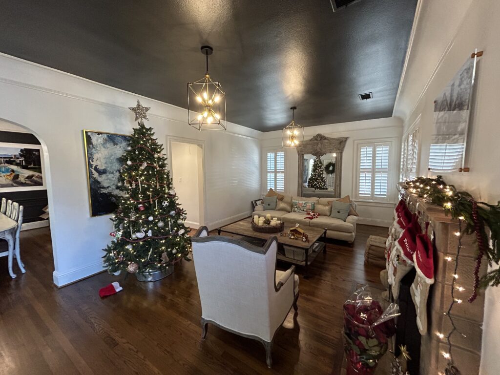
Trim color can make or break a warm neutral paint scheme, and this is where many DIY projects go sideways. Pairing a warm beige wall with a stark, cool white trim creates a jarring contrast that makes the beige look dirty. Instead, choose a warm white trim like Alabaster, White Dove, or Swiss Coffee to keep the palette harmonious. The trim should feel like a lighter sibling of the wall color, not a stranger from a different family. Semi gloss or satin finishes on trim add subtle shine that frames each wall nicely. Baseboards, crown molding, door casings, and window frames should all match for a cohesive look. Fresh trim paint also sharpens the entire room, since trim collects scuffs faster than walls. Many homeowners are shocked at how much newer their home feels after trim alone is repainted.
Cabinets are the largest painted surfaces in kitchens and bathrooms, so they must coordinate with your new wall color. Warm neutral walls pair beautifully with cabinets in cream, mushroom, sage green, deep navy, and rich wood stains. Avoid pairing warm walls with cabinets that have strong cool gray finishes, because the mismatch reads as accidental. If your existing cabinets clash with the warm neutral you love, refinishing them is far cheaper than replacement. Cabinet refinishing typically costs a fraction of new cabinetry and delivers a factory smooth finish. Autumn is a popular season for kitchen updates since families host more gatherings from Thanksgiving through New Year. Coordinating your wall and cabinet colors in one project guarantees the palette works as a whole. It also means one round of prep and one cleanup instead of two separate disruptions.
Flooring and countertops round out the pairing decisions, and they should be evaluated before paint is selected, not after. Warm neutrals flatter oak, hickory, and walnut floors, along with most luxury vinyl plank in warm wood tones. Travertine, beige tile, and warm toned granite common in North Texas homes also pair naturally with these colors. Cool white marble or gray quartz needs a carefully balanced greige rather than a yellow heavy beige. Bring a sample of your flooring or countertop to the paint store when comparing swatches. View them together under warm light to simulate autumn evenings at home. Undertone conflicts between floors and walls are the most common reason homeowners dislike a finished paint job. A ten minute comparison prevents that outcome entirely.
Testing Warm Neutral Paint Colors Before You Commit
Testing is the step homeowners skip most often, and it is the step professionals never skip. A two inch paper swatch cannot tell you how a warm neutral will behave across a twelve foot wall. Buy sample quarts or peel and stick samples of your top two or three candidates. Paint or place them on multiple walls in the same room, because each wall receives different light. Include at least one sample near the floor and one near a window. Look at the samples in the morning, at midday, and after dark under your actual lightbulbs. Live with them for two or three days before deciding. Colors that win under all lighting conditions are the ones worth committing to.
Sample size matters, so make each test patch at least two feet by two feet. Small patches get visually swallowed by the existing wall color surrounding them. If your current walls are a strong color, paint a white primer square first and sample on top of it. This isolates the new color and shows its true undertone. Compare samples side by side rather than one at a time, since the eye judges color relatively. Take photos of each sample at different times of day and review them together. Photos often reveal undertone differences your eye misses in person. Label each sample with painter tape so you do not mix up similar shades later.
Sheen testing is the final piece, because the same color looks different in flat, eggshell, satin, and semi gloss. Higher sheens reflect more light and make warm neutrals appear slightly lighter and cooler. Flatter sheens absorb light and deepen the coziness, which suits autumn goals well. Most sample quarts come in one sheen, so ask the paint store which sheen your sample uses. Factor in durability needs for each room, since hallways and kids rooms demand washable finishes. A professional color consultation can compress this entire testing process into a single visit. Experienced painters have seen these exact colors in hundreds of local homes and can predict how they behave. That local knowledge is one of the biggest advantages of hiring a professional over guessing alone.
Why You Need A Professional Painter For Warm Neutral Paint Colors This Autumn
Warm neutral paint colors look simple, but they are unforgiving of poor prep and sloppy application. Subtle shades show every roller mark, patch line, and missed sanding spot once the light hits them. A professional crew delivers smooth, even coverage that makes these soft colors look intentional and high end. Scheduling your project now, in July, means your home is finished well before the busy fall season. Painters book up quickly from September through November as homeowners rush to prepare for the holidays. Beating that rush gets you better scheduling flexibility and a home that is cozy and ready when autumn arrives.
Professional Prep Work Makes Warm Neutral Paint Colors Last
Prep work is the foundation of every long lasting paint job, and it matters even more with light neutral shades. Warm whites and beiges are thin on pigment compared to dark colors, so surface flaws telegraph straight through the finish. Professionals fill nail holes, repair drywall dings, sand glossy spots, and caulk gaps before any color goes on. They also prime stains, patches, and previously dark walls so the new neutral covers evenly. Skipping primer over a dark wall often leads to three or four wasted coats. Proper prep is the difference between a paint job that lasts ten years and one that fails in two.
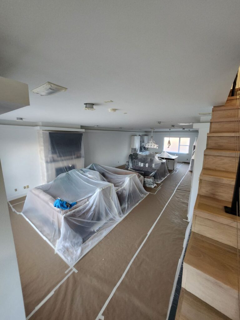
Clean lines are another mark of professional prep that homeowners notice immediately. Crisp edges where warm neutral walls meet white trim make the whole room look sharp. Achieving those lines requires careful taping, steady cutting in, and quality brushes. Professionals also protect floors, furniture, and fixtures with drop cloths and plastic sheeting throughout the job. Venture Painting crews are known for keeping work areas clean, organized, and respectful of your home. You get a beautiful result without spending your weekend scrubbing paint splatter off the baseboards.
Surface repairs sometimes reveal bigger issues like cracked drywall, water stains, or texture damage. A professional painting company handles these repairs as part of the project instead of painting over problems. Drywall repair done correctly disappears completely under the new finish. Painting over damage without repair guarantees the flaw shows through your beautiful new neutral. Have wall damage that needs fixing before your autumn repaint? Click here for our drywall repair service.
Expert Color Matching For Warm Neutral Paint Colors
Color matching is a genuine skill, and undertones in warm neutrals are where most DIY choices go wrong. A professional has applied these exact shades in hundreds of local homes under North Texas light. They know which beiges turn yellow in south facing rooms and which greiges go green next to oak floors. That experience means you get the right color on the first try. Guessing wrong costs you the full price of a repaint. Expert guidance is essentially free insurance on your investment.
Professionals also understand how colors flow from room to room in open floor plans. They can recommend a whole house palette where the living room, kitchen, hallways, and bedrooms feel connected. Coordinating wall colors with existing trim, cabinets, and flooring is part of that consultation. A skilled estimator will walk your home, evaluate the light in each room, and flag potential undertone conflicts. This level of planning turns a simple paint job into a cohesive design upgrade. It is the difference between a house that got painted and a home that feels designed.
Application technique affects color too, which surprises many homeowners. Consistent roller pressure, proper wet edges, and correct coat thickness keep a warm neutral uniform across every wall. Uneven application creates flashing, where patches of the wall reflect light differently. Professionals use quality tools and proven techniques that eliminate these issues. The result is a smooth, even, cozy finish that looks the same at noon and at night. That consistency is exactly what warm neutrals need to shine.
Why Choose Venture Painting For Warm Neutral Paint Colors In Plano
Venture Painting is a local Plano company that specializes in interior and exterior painting for homeowners across the area. Our crews are friendly, professional, and treat your home with genuine respect from start to finish. We handle detailed prep work on every project because we know it is what makes results last. Homeowners throughout Plano, Richardson, Allen, Murphy, and nearby communities trust us for exactly this reason. We show up on time, communicate clearly, and leave your home cleaner than we found it. That reputation is something we protect on every single job.
Our estimates are free, and our pricing is clear and honest with no surprises. We walk your home with you, discuss your color goals, and give straightforward recommendations for your specific rooms and light. If you are torn between two warm neutrals, we will tell you honestly which one suits your space. We would rather guide you to the right choice than sell you a bigger job. That approach has built our reputation across the Dallas area. Honest advice costs nothing and saves you thousands.
July is the ideal time to schedule your autumn interior painting project before fall calendars fill up. Booking now means your warm, cozy neutral walls are finished long before the first cool front arrives. Your home will be ready for football season, Thanksgiving hosting, and every holiday gathering after that. Contact Venture Painting today for your free estimate and expert color guidance. Call us at (214) 233-6044 or email zeb@venturepaintingdfw.com to get started. Let us make your home the coziest house on the block this autumn.